Over at The New York Times Magazine’s enjoyable 6th Floor blog, Hilary Greenbaum asks “Who made that Oreo emboss?”
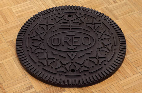
IMAGE: Oreo manhole cover, by Andrew Lewicki, an LA-based artist whose work also includes crates of Southern California concrete oranges and a combination ashtray/juicer, for the perfect Parisian breakfast.
Interestingly, when the Oreo was first introduced by Nabisco in 1912, it used a much more organic wreath for its emboss, later augmented with two pairs of turtledoves in a 1924 redesign. The contemporary Oreo stamp was introduced in 1952, and it has remained unchanged, and, in the words of Pulitzer Prize-winning architecture critic Paul Goldberger, “the stuff of legend,” ever since.
Writing in 1986, to mark the cookie’s seventy-fifth birthday, Goldberger declared that the Oreo “stands as the archetype of its kind, a reminder that cookies are designed as consciously as buildings, and sometimes better.” Comparing the Oreo to its less successful competitor, the Hydrox, Goldberger notes:
Still, it is the Oreo that has become the icon. And after all, it is the more American-looking of the two — its even pattern, however dowdy, has an industrial, stamped-out quality. It might be said to combine homelike decoration with an American love of machine imagery, and in that combination lies a triumph of design.
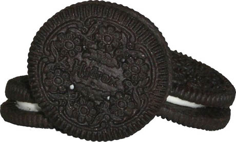
IMAGE: The late, lamented Hydrox cookie, whose pattern is, according to Goldberger, “at once cruder and more delicate than the Oreo’s; the ridges around the edge are longer and deeper, but the center comprises stamped-out flowers, a design more intricate than the Oreo pattern.” Photo via Wikipedia.
However, despite the iconic status of the Oreo emboss today, the identity of its designer remains murky. As Greenbaum reports:
Many Internet resources have credited William Turnier as the man behind the four-leaf clover and serrated-edge design, but Nabisco could confirm only that a man by that name worked for the company during that time as a “design engineer.”
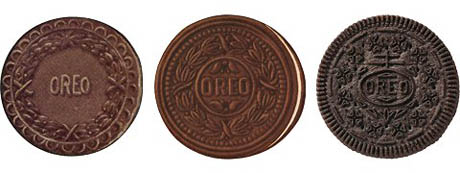
IMAGE: The evolution of the Oreo emboss, from 1912, to 1924, to today, courtesy Nabisco, via The New York Times.
In reply to Greenbaum’s post, a comment by “Bill,” who claims to be William Turnier’s son, raises the intriguing possibility that the original blueprints for the Oreo emboss may be hanging over the door of a family room in Chapel Hill, North Carolina. I hope design museums around America are sharpening their acquisitionary claws.
As it turns out, online Oreo-obsessives have spent as much time decoding the design as they have speculating on the identity of the designer. The circle topped with a two-bar cross in which the word “OREO” resides is a variant of the Nabisco logo, and is either “an early European symbol for quality” (according to Nabisco’s promotional materials) or a Cross of Lorraine, as carried by the Knights Templar into the Crusades. Continuing the Da Vinci Code-theme, the Oreo’s geometric pattern of a dot with four triangles radiating outward is either a schematic drawing of a four-leaf clover or — cue the cliffhanger music from Jaws — the cross pattée, also associated with the Knights Templar, as well as with the German military and today’s Freemasons.
No wonder the Oreo has become the most powerful cookie in the world, with more than 491 billion sold to date.
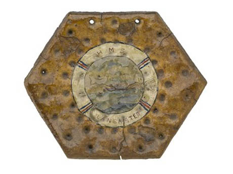
IMAGE: A hexagonal ship’s biscuit, painted by an anonymous sailor, and showing evenly spaced docker holes, c.1906, National Maritime Museum.
Conspiracy theories aside, the origins of 3D biscuitry are both pragmatic and decorative. The practice of punching holes in biscuits is known as “docking,” and has been done by bakers for centuries in order to prevent uneven puffiness and promote flat crispness. According to British cookery writer, Elizabeth David, a pre-mechanisation docker was “a dangerous-looking utensil consisting of sharp heavy spikes driven into a bun-shaped piece of wood.”
Meanwhile, across Europe, a parallel and equally time-honoured tradition of decorative waffle irons and wooden moulds emerged, used to emboss religious symbols on communion wafers, coats of arms on Italian pizzelle, and courtly imagery on German springerle.
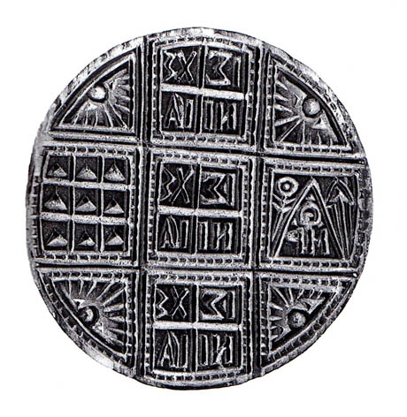
IMAGE: Wooden eucharistic wafer stamp from Epirus, Greece, via A History of Food by Maguelonne Toussaint-Samat.
The turn of the nineteenth century saw the birth of the industrial biscuit, and, with it, the marriage of these two morphologies — docking and decorating — into an automated production line. In the late 1890s, two cousins, both called Thomas Vicars, designed the first embossing and cutting machine, capable of punching holes, stamping decorations, and cutting out up eighty biscuits per minute from a moving sheet of dough. The dies were necessarily hand carved until engraving machines were introduced in the early 1900s.
Thin, hard biscuits, such as the Rich Tea and Morning Coffee, are still made in almost exactly the same way. But the true golden age of biscuit engineering did not dawn until the invention of the rotary moulder in the late 1920s.
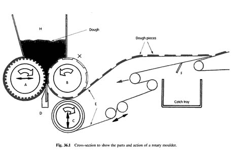
Diagram of a rotary moulder, from Technology of Biscuits, Crackers, and Cookies, by D. J. R. Manley
This technology, albeit updated with variable speed controls, advanced non-stick coatings, and quality sensors, is still used to make Oreos and most other thick embossed biscuits today. The cookie dough is forced into negative moulds, which imprint patterns, brand names, and docker holes. A scraping knife (“D” in the diagram above) scrapes off any excess dough to give a flat bottom, and the formed biscuits peel away onto a conveyor belt to be baked.
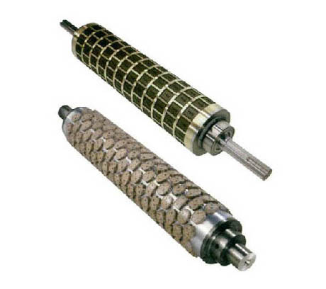
IMAGE: Weidenmiller rotary moulding rollers.
This, then, is the enduring technology behind the blend of baking science and aesthetic appeal that is an embossed cookie. But what of the designers who created equally long-lasting moulds or dies?
For the most part, unlike the Oreo’s William Turnier, they remain not only anonymous but completely disregarded. No one seems to know or care who created the stylized ferns on the Custard Cream, which remain unchanged since their debut in 1910; or the Art Deco steaming cup on the cardboard-like Morning Coffee biscuits of my youth.
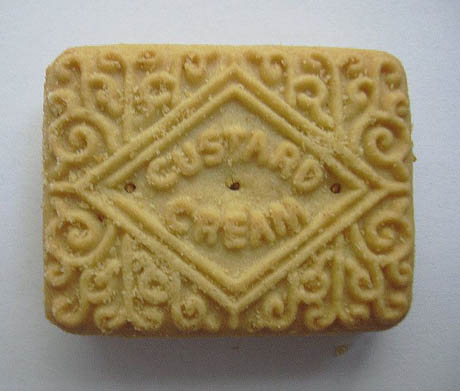
IMAGE: The Custard Cream: Britain’s favourite biscuit. Photo via Wikipedia.
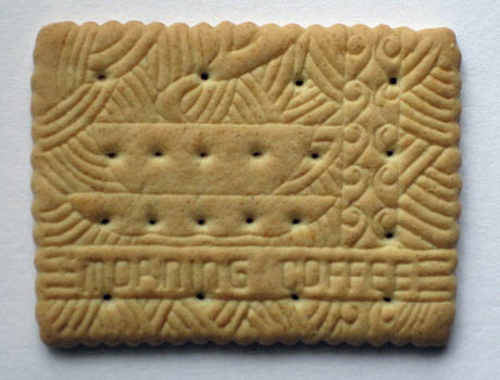
IMAGE: Lovely design, shame about the biscuit. A Morning Coffee, via.
This tradition of biscuit design anonymity seemingly continues into the present day. The Weidenmiller company of Illinois, for example, promises that its team of nameless artists will “develop any design from a conceptual thought,” while Italy’s Errebi Technology offers more than 500 rotary mould shapes off the shelf — and utterly uncredited.
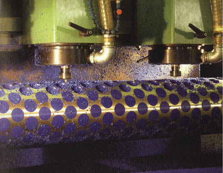
IMAGE: Machine carving rotary moulds today, courtesy Errebi Technology.
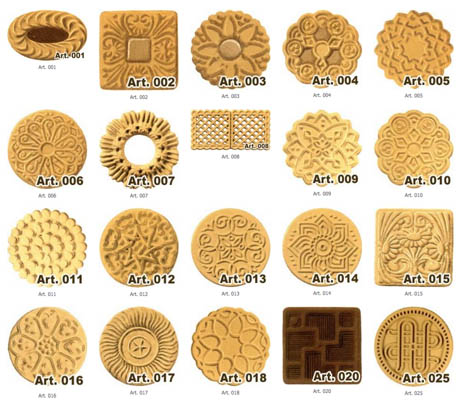
IMAGE: Errebi’s ready-to-order emboss shapes, page 1 of 26.
To my mind, these classic biscuits — ubiquitous, overlooked, and yet embodying the highest design standards in both form and function — are worthy of recognition as “humble masterpieces,” to borrow Paola Antonelli’s terminology.
Time to make a nice cup of tea and appreciate one or two of them myself, I suppose.

