As advertised in my last post, from January 18 through 23, I launched GOOD’s new Food hub with a week-long blog festival called Food for Thinkers. In the end, an incredible forty-three writers, designers, and presenters from a wide variety of backgrounds joined in by contributing their own post about what food writing is or could be. And, as I had hoped, they each addressed the question differently, some by argument, some by citing examples, and some by demonstration.
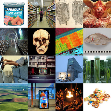
IMAGE: Photos from some of the fifty-four different posts that formed part of Food for Thinkers week at GOOD. Please see individual posts for full image credit information.
The result was an incredible mixture of stories, ideas, opinions, and proposals — and a lot of great writing. There were arguments in favour of preserving agricultural biodiversity that invoked medieval soldiers and controversial critiques of artisanal food; there were introductions to favourite food writers and neglected subgenres; and there were archaeologists, architects, and activists who expanded the territory of food writing by simply using food as a filter through which to re-frame their own interests in Tibetan independence, prison design, and the material remains of human civilisation.
But don’t take my word for it — if you haven’t done so already, check out the full menu of posts over at GOOD. There’s a lot to read, but believe me, it will not be time wasted.
Sadly, I was so busy curating Food for Thinkers at GOOD that I completely failed to add my own contribution here on Edible Geography. Still, inspired by the week’s writings and motivated by my shiny new logo (soon to be incorporated into an overall site update), I thought I’d take the opportunity to post a story that perhaps illustrates something of why I think edible geography is such an important and endlessly interesting subject to write about.
IMAGE: Edible Geography’s new logo, designed by Nikki Hiatt.
If I had to describe my aspirations for Edible Geography, I could do a lot worse than this, borrowed from a post at InfraNet Lab about Foodprint Toronto in which Lola Sheppard redefines the role of the architect:
A cultural, environmental and spatial detective, bringing to light the forces (economic, cultural and environmental) at work within a given geography, and the physical networks at the service of these forces.
The detective analogy is certainly appealing: I started Edible Geography in the hope of using food (in the broadest possible sense) to reveal something hidden, unexpected, or new about the world in which we live. Meanwhile, I appropriated from the discipline of geography the same idea that Lola is proposing for architecture: that both the physical landscape and the social and metaphorical world can be analysed through the (food-related) forces that shape and are shaped by them.
For the most part, that exploration is motivated by curiosity for its own sake — the same desire to see the world through fresh eyes that also inspires me (and others with the time and opportunity) to read books, visit exhibitions, travel, or make things. But I also believe that these novel perspectives can yield insights that help us to design better systems, cities, spaces, and lives. The following story is one of my favourites because it demonstrates both processes: it offers a new way of understanding the city and a speculative intervention based on those observations.
Naa Oyo A. Kwate is an Associate Professor in the Department of Human Ecology at Rutgers University. She spoke as part of the Culinary Cartography panel at Foodprint NYC, and I subsequently interviewed her for the Food issue of the New City Reader (most of the rest of this post is drawn from the resulting article).
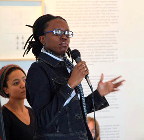
IMAGE: Naa Oyo A. Kwate speaking as part of the Culinary Cartography panel at Foodprint NYC; photo courtesy Studio-X New York.
Kwate’s research maps the urban environment in terms of its impact on health, with a particular focus on individual and neighbourhood inequality. In one of her earliest studies, she mapped the distribution of fast food across all five boroughs of New York City, only to discover that “the percentage of black residents in a neighbourhood was by far the biggest predictor of fast food density.”
In other words, although it is a commonly-held assumption that you find more fast-food restaurants in black neighbourhoods because they are frequently also lower-income neighbourhoods and thus fast food’s target market, Kwate found that “income really had no relationship” to fast-food exposure. Instead, the equation is simple: “For low- and middle-income groups, the more black people there are, the more fast food there is, and the more white people there are, the less fast food there is.”
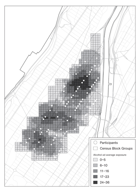
IMAGE: Map redrawn by Evan Allen, based on data gathered by Naa Oyo A. Kwate and Ilan H. Meyer and originally presented in the American Journal of Public Health.
The map above is drawn from another of Kwate’s studies, this time looking how alcohol advertising in Central Harlem affects drinking behaviour. Several other researchers have shown that there is a disproportionate amount of alcohol advertising in predominantly black neighbourhoods compared to predominantly white neighbourhoods. Kwate’s study not only revealed that an astonishing twenty-five percent of the outdoor advertising space in Central Harlem was dedicated to selling alcohol, but also that exposure to these ads increased black women’s chances of being a problem drinker—by up to thirteen percent. That, as she puts it, is “a really big deal.”
What’s more, Kwate noted, “apart from the density of liquor exposure, the messages and the kinds of themes that also appeared in the advertising were themselves a kind of toxic exposure. A lot of them reproduced and drew upon stereotypes of black people — that black men are sexual studs, and that black women are sexually licentious and available.” Added to that, she was disturbed to see, “in a poor neighbourhood, a lot of messages saying that you can use alcohol as a means to achieve social mobility.”

IMAGE: Alcohol advertisement in Central Harlem; photo by Naa Oyo A. Kwate.
Having mapped toxic exposures within the built environment and then demonstrated their negative impact, Kwate’s current project aims to go one step further, to turn spatial patterns into a design intervention by launching what she calls a “counter-marketing campaign.”
Her ambitious five-year study, funded by a NIH Innovator Award, began with a fleet of researchers armed with bike-mounted action cameras, riding around the city and collecting data, “not just on the numbers of things, like how many fast-food restaurants and alcohol ads are on every street, but also the way things look and the message they send by the way they’re constructed and maintained.” She’s currently combing through the footage, and returning to neighbourhoods on foot to track a range of environmental factors, from how many businesses are embedded with bullet-proof glass to “what kinds of ideas and issues are present in both standard outdoor media and also ‘home-made’ ads — the sorts of flyers you might see posted up for jobs.”
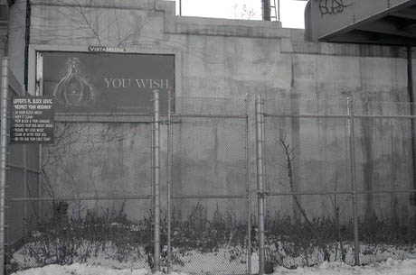
IMAGE: Alcohol advertisement in Central Harlem; photo by Naa Oyo A. Kwate.
Next, Kwate will correlate the ways in which these characteristics of the built environment and exposure to negative imagery affect individual health, by measuring biological markers such as immune function in neighbourhood residents. Finally — and most excitingly — she’s actually going to buy outdoor advertising spaces, use them to disseminate stark facts about racism and inequality, and then measure her participants’ health pre- and post-exposure, in order to evaluate the impact of her own intervention.
The idea, Kwate explains, is to “play off the finding that, in some instances, African Americans — particularly those of lower income — who deny experiences of racism actually have worse health than those who report it.” Rather than a message of uplift, her ads will, she hopes, sensitize residents to the pervasive inequalities embedded in their streets and storefronts. Although this counter-marketing campaign is still a few years away, Kwate offers an example of the kind of message she might want to communicate in an bus shelter ad: “Normally, this space has a liquor ad in it.”
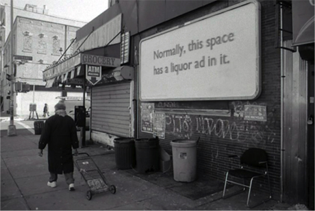
IMAGE: Mock-up by me; original photo by Naa Oyo A. Kwate.
In other words, Kwate is not just mapping the geographical correlation that ties together race and health indicators with behavioural cues that are embedded in the urban environment, primarily in food and beverage outlets and advertising — she’s then using that analysis to design her own spatial, physical, and psychological intervention.
It is edible geography at its finest: an exploration that not only allows you to understand the landscape in a new way, but also equips you to speculatively reshape and improve upon it.
That said, Kwate is adamant that better regulation would be a more effective and practical design intervention than simply changing the message. Buying ad space, she notes, “costs a lot of dough,” but more importantly, “at the end of the day, it’s still just an exhortation to people to change their individual behaviour.” Raising consciousness about calorie counts and sugary sodas is important, she says, but, “there’s more to this than a simple individual choice — the norms of your neighbourhood and the prevalence of certain options shape what you imagine food or dining out could be in the first place.”
[NOTE: My conversation with Naa Oyo Kwate was originally published in the New City Reader food issue, edited in collaboration with Will Prince and Krista Ninivaggi, which you can now read in full online. I’d also encourage you not to miss the fantastic posts written as part of Food for Thinkers week—visit GOOD to explore the full list.]
